
Like many people, I get occasional requests, in my emails. Actually, several times a day. Addressed to me, personally.
Which makes me feel pretty important… even though most of the emails are generated by computer algorithms.
Some of the algorithms want me to buy something from them. Other algorithms want to convince me that the election was stolen, and Donald Trump is still my president. (Why an algorithm would care who the president is, I have no idea.)
On a rare occasion, I get an email from a real person. Even more rarely, I get an email from my ex-wife, Darlene. This happened yesterday.
Darlene wrote to me:
“Louis, I’ve attached some graphs I found at the San Juan Basin Public Health website. Can you help me understand what they mean?”
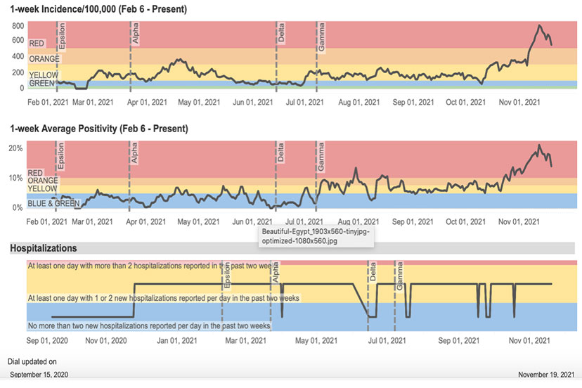
The graphs looked like this:
As I confessed, emails, sent to me by algorithms, make me feel somewhat important. Emails from real people make me feel really important.
Emails from my ex-wife, asking for my help? I am in heaven.
I will also admit, however, that the graphs Darlene sent were intellectually challenging. At first glance, they seemed to be implying some kind of relationship between COVID infections and the LGBTQ Pride Flag.
This might have been unintentional. But it also might indicate that the people working at the Colorado Department of Public Health and Environment, who developed the color scheme, are liberals. Or even gay.
(This is not homophobia. I personally like the Gay Pride Flag, maybe better than the American Flag. In terms of color choice, I mean. Design-wise, both flags make heavy use of horizontal stripes, which is not my favorite. America and the LGBTQ community both could have picked something a bit more creative. For example, something exciting, like a trout rising to chomp on a careless mayfly. I would have voted for that kind of design. For either flag. In certain instances, this would be a rainbow trout.)
At any rate, the top two COVID graphs show the progression of certain trends in Archuleta County, since January 2021. In the top graph, our ‘incidence rate’ for almost all of 2021 bounced around between “50 per 100,000” and “300 per 100,000”. Then, starting on about October 10, it pretty quickly shot up to “778 per 100,000” on November 12, before starting a downward trend.
The second graph is the ‘average positivity rate” — which refers to the proportion of ‘positive’ tests, not to the percentage of ‘positive feelings’ among the population. The graph of ‘positive feelings’ would probably look really different.
Since the end of July, the ‘positivity rate’ has been hanging around 8%… until about October 24, when things took off and rather quickly reached 21% on November 12. That’s a surprising percentage of positive tests. I’m glad I wasn’t one of them.
But how to explain these graphs to Darlene? Things like ‘incidence rates’ and ‘positivity rates’ sort of go over her head. (At least, they did when we were married.)
I needed to provide a simple explanation.
I wrote back to her, with a concise theory:
“Darlene,
“Please note that these graphs have nothing to do with the Gay Pride Flag. The color choices are purely coincidental.
“Basically, the graphs show that the infection rates got worse, as more people were vaccinated. Things got particularly bad after people started getting their booster shots.”
Darlene wrote back.
“That’s what I thought.”
Underrated writer Louis Cannon grew up in the vast American West, although his ex-wife, given the slightest opportunity, will deny that he ever grew up at all. You can read more stories on his Substack account.