
GPT-5 is here… Now powering ChatGPT. Try it for free
Our smartest, fastest, and most useful model yet. Better everyday chats at school, work, and beyond. Reasoning built in for the best answers. Improved writing with clear, compelling text. Stronger coding from quick to complex builds. Expert intelligence for everyone. We can’t wait for you to experience it.
Best,
The ChatGPT Team
Hopefully, we’re going to be laughing as the world ends.
As the world ends for the human race, I mean. Other lifeforms that take themselves more seriously will carry on, no doubt, long after we’re gone.
I’m not proposing that this will happen soon — the end of the human race, and the laughter that accompanies the event — although it’s entirely possible it will happen within my own lifetime… what with all the nonsense we’re hearing about artificial intelligence taking over, and eventually deciding that human beings are unnecessary, and annoying.
But I’m laughing already. Getting prepared for the end. Also, laughing because artificial intelligence may not be as intelligent as they’re telling us.
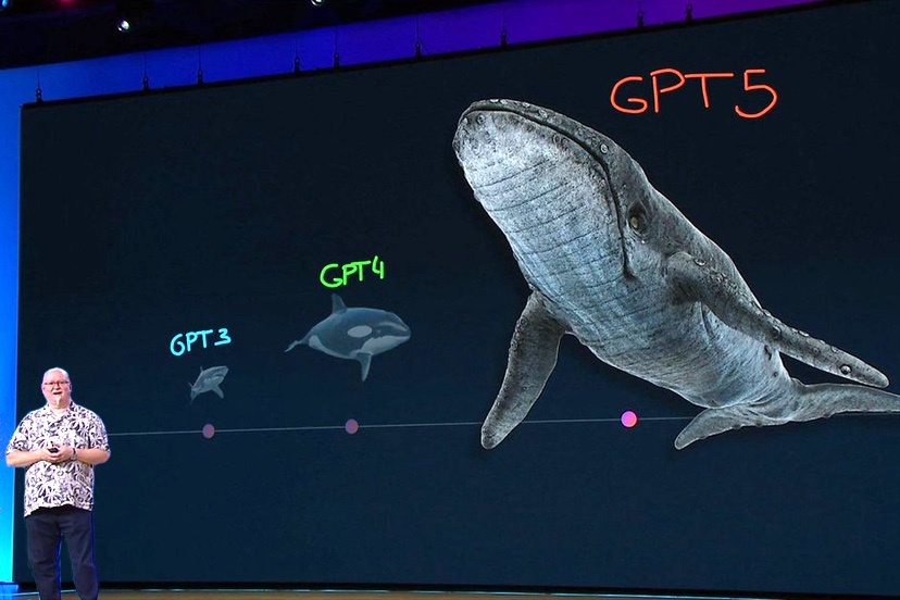
I came across this funny “SWE-bench Verified” illustration yesterday. Not merely “funny-unusual” but also “funny-ha-ha”.

During a demonstration Thursday of ChatGPT’s newest version of its Large Language Model, GPT-5, OpenAI shared a graph in which it appeared 52.8% was a much larger value than 69.1% , which was in turn somehow the same as 30.8%.
I wasn’t a great math student, but I’m pretty sure 69.1% is more than 30.8%, and also more than 52.8%.
GPT-5 didn’t agree, apparently.
This type of faulty, non-intelligent illustration has a name. “Chart crime”. The ChatGPT chart crime shown above generated hundreds of snarky tweets, according to the Washington Post.
I assume that those “chart crime” tweets were from actual humans, but they might have come from competing AI platforms? Platforms with a sense of humor?
Humans can also commit chart crimes, intentionally or unintentionally. But in 2025 it’s hard to tell if any of the charts are made by actual humans.
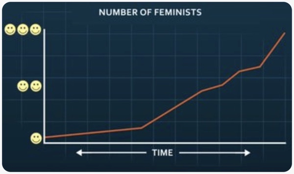
I think the chart below was made by humans, to judge by the handwriting, apparently by a six-year-old.

Typically, a chart has a Y-axis, going upward with increasing numbers, and an X-axis going left to right, again with increasing numbers. Often the X-axis marks time elapsed, in days or months or years, and the Y-axis displays something that happened during the elapsed time.
But sometimes they leave off the Y-axis and just show us some animals that live in the ocean. Sharks, killer whales and humpback whales, for example.
Other times, they show us women of various heights. For example:
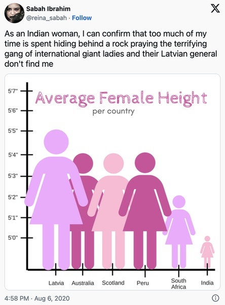
Here, the X-axis shows various countries instead of a timeline. And the Y-axis has a scale indicating average heights for adult women.
The particular chart crime in the graph above is surprisingly common. Probably about as common as shoplifting. The chart committed the crime of starting the Y-axis at a number other than “Zero”.
The actual difference in height between the Latvian woman and the Indian woman is actually only 5 inches, but because the Y-axis starts at about 4’10”, the woman from India looks to be about the size of a Barbie Doll.
Most people never bother to look at the Y-axis, which is why many Americans believe that women from India are incredibly small.
I ran across a similar criminal chart comparing the heights of various female pop singers.
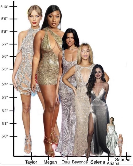
Lady Gaga also turns out to be incredibly tiny, much like the women in India.

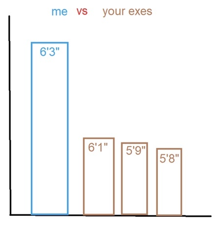
On some occasions, the chart-making criminals simply leave all the numbers off the Y-axis, which can make a person seem especially tall, and perhaps more attractive?
Like, maybe he’s much much taller than the woman’s ex-boyfriends?
2 inches of height can seem quite impressive if you leave off the Y-axis numbers.
For even more interest, you can leave off the X-axis numbers as well.
And you can use emojis instead of number values along the Y-axis.
Anyway, we are finding out that neither humans nor AI can be fully trusted to produce legitimate charts. Crime is everywhere, especially in Washington DC. And I’m not talking about people stealing cars.
This column was inspired because I got a message that ChatGPT-5 — the new version — was available for testing, free of charge. And I can’t resist anything that’s offered for free.
So I wrote this prompt, inspired by Bill Hudson’s recent editorials here in the Daily Post about the growth of tourism.
ChatGPT, make a graph showing the growth of Lodging Tax revenues in Archuleta County from 2007 through 2024.
In my past experiences with ChatGPT, the AI engine was able to answer my questions within about 10 seconds. But this time around, ChatGPT sent me a series of brief messages, letting me know it was “thinking” about how to answer my request. Apparently, ChatGPT had previously responded without thinking, but this time around, it kept “thinking” for nearly a minute and a half.
Finally I got my response.
I can totally make that—just need the yearly revenue numbers.
I’ve dropped a ready-to-fill sheet with all the years 2007–2024 here:
Download the CSV template
Pop in the annual Archuleta County lodging-tax revenues (USD) for each year and send the file back (or paste the numbers). I’ll immediately turn it into a clean line chart showing the growth across 2007–2024, with labels and % changes.
In other words, ChatGPT wanted me to do all the work of finding the data.
But if it was actually thinking, it could have simply plagiarized the Lodging Tax chart that editor Bill Hudson had already shared several times on the Daily Post.
Am I disappointed? Not at all.
If AI doesn’t even know how to plagiarize an existing chart, we can all feel confident that AI will not be taking over the world. Ha ha!
Underrated writer Louis Cannon grew up in the vast American West, although his ex-wife, given the slightest opportunity, will deny that he ever grew up at all. You can read more stories on his Substack account.