I noticed that the Daily Post’s real estate columnist, Lee Riley, offered the analysis, this week, that the Pagosa Springs market has shifted rather suddenly from a ‘sellers market’ to a ‘buyers market’, and that the change might be related to economic factors. He noted:
“…interest rates have doubled, inflation is out of control, the stock market is tanking, there’s a war overseas, gas prices are out of sight, and consumer confidence is dwindling.”
He didn’t mention that City Market was completely out of cinnamon raisin bagels last week.
But some people will tell you, “Things aren’t as bad as you think”. I am one of those people. In fact, I’m sort of the poster child for the positive outlook… in spite of the mostly negative columns I’ve been publishing over the past few years.
We have to start with the assumption, of course, that you think things are bad. And there’s no doubt that some things are indeed bad. The bagel situation, for one. And the stock market might be another, as Mr. Riley suggests.
But looking at the entire world — something most people rarely do — things might not be as bad as you think. It’s a big world, and it’s not easy to look at the whole thing.
Luckily, a family of Swedish researchers have been looking at the whole thing for a number of years now: Hans Rosling, Ola Rosling and Anna Rosling Rönnlund, who developed the website, Gapminder.org. And they made some colorful graphs to illustrate their suspicion that things, in general, used to be a lot worse than they are right now. A lot worse.
Things like hunger, life expectancy, sex, climate, war.
Actually, climate is a lot worse than it used to be. But let’s focus on hunger, life expectancy, war, and sex, and keep things positive.
Let’s take ‘Life Expectancy’ for starters. (I know, you were hoping we’d pick ‘sex’ for starters. Patience, my friend. Anticipation is the greater part of pleasure.)
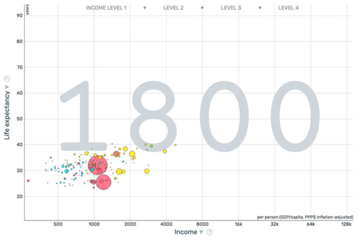
Here’s a Gapminder’s chart for global life expectancy, in the year 1800. (It’s an estimate. Who really knows for sure?) The size of the bubbles indicates the population of each country. Western hemisphere countries (like the U.S.) are colored green. Asian countries are pink; European countries are yellow; Africa is blue.
The U.S. is the little green bubble at the upper right of the group. China is the largest pink bubble.
The Y-axis is the ‘Life Expectancy’, which was pretty much dismal, no matter where you lived. We need to remember, however, that the main reason ‘Life Expectancy’ was so low — between 25-40 years — is because most children died before reaching the age of 5, and that brought down everyone’s average ‘Life Expectancy’. If you made it to 5 years old, things weren’t so bad. You might live to be 100.
The X-axis shows the household income, mostly around $500-$1,000 a year. People were poor, in those days, everywhere, even adjusted for inflation. (Yes, they had inflation even in 1800.) You might live to be 100, but you would be really poor.
But then again, people didn’t have car payments or student debt.
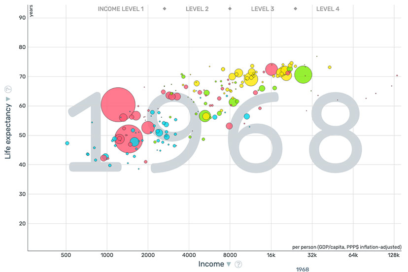
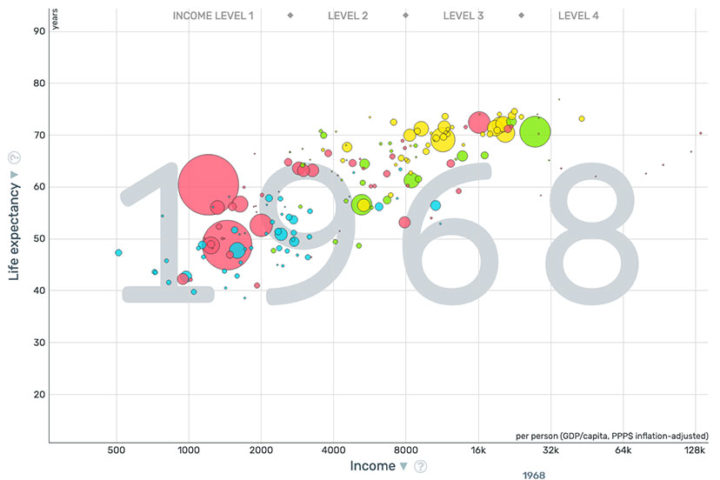
On the Gapminder’s website, you can pick any year you want, and see how the ‘Life Expectancy’ changes with improvements in family income. So I naturally picked 1968. (The year I was born.)
As we can see, all the bubbles are bigger than in 1800, because the whole world was living a lot longer, on average. Europe (yellow) and the U.S. were at about 70 years, and had incomes (adjusted for inflation) of between $8000 and $20,000 per year. Japan (the larger pink bubble at the top right) was doing slightly better than the U.S., in terms of ‘Life Expectancy’.
But what’s really interesting is that people in China (the biggest pink bubble) had about the same income as they had in 1800… but their ‘Life Expectancy’ was much, much better. 60 years, on average.
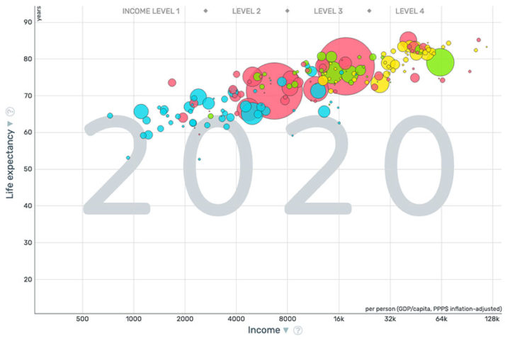
Here’s the most recent graph at Gapminders. The year 2020. Larger bubbles for everyone. Clearly, people have not stopped having sex.
Pretty much everyone now has a ‘Life Expectancy’ of more than 60 years… even Africa (blue), with half the income of European countries (yellow). China has pulled level with the U.S. in terms of ‘Life Expectancy’… on one-quarter the average income? (How did they do that?)
Japan is kicking ass, in terms of “Life Expectancy”. If we are having a contest. Which I guess we are?
The stated goal of Gapminder — which is essentially the Rosling family — is to prove to the world that “things are not as bad as we thought.” In spite of a growing global population, people are eating better and living longer and buying cars and incurring student debt.
But we still have that issue with the cinnamon raisin bagels.
Underrated writer Louis Cannon grew up in the vast American West, although his ex-wife, given the slightest opportunity, will deny that he ever grew up at all. You can read more stories on his Substack account.


