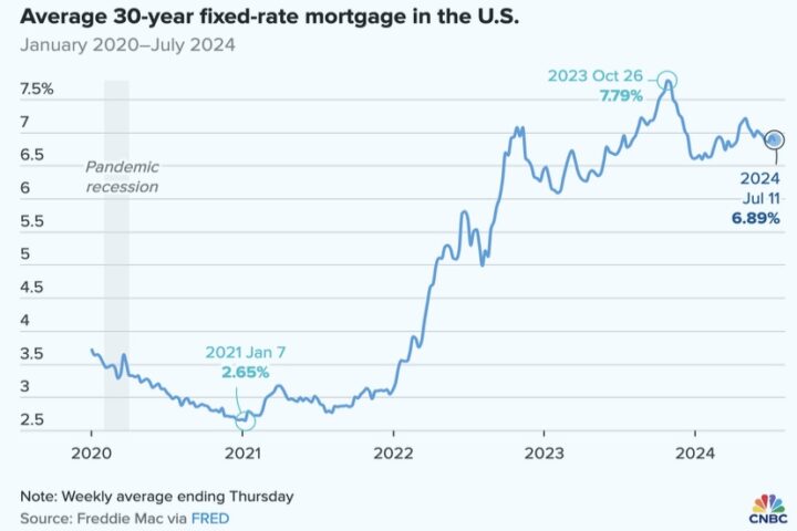
In a colorful report published by CNBC last weekend, journalists Gabriel Cortés and Alex Harring discussed the housing market in America.
“The housing market explained in six charts”
Or so they claimed.
I can’t imagine how many hours they spent creating those charts. But the charts didn’t actually ‘explain’ anything. They just made the current situation look really bad — as only colorful charts can do — but without really telling us why it’s so bad.
In my humble opinion, you “explain” something by revealing the secret of why it happened. Anybody, even a journalist, can tell you what happened. But what we want to know is, why it happened.
The first chart, for example…

Anyone who’s been paying attention knows that the Federal Reserve increased the interest rates from less than 3% in 2021, to almost 8% in late 2023. It’s still at almost 7%.
Why? Why did the Fed do that?
Did it make homes any cheaper? Of course not. Did it bring down my rent? Ha! Very funny. My landlord increased my rent by $200 a month. Her excuse? “Inflation.”
From what I can tell, the people who sit on the Board of the Federal Reserve are a bunch of millionaires and billionaires who own banks and corporations, and probably wouldn’t even notice it, if their rent increased by $200. But they’re all concerned about inflation, of course, because a billion dollars becomes less than a billion dollars after inflation gets a hold of it.
If you have $100 in your savings account (like some of us) and inflation this year is 5%, your account will be worth only $95 next year. That’s one less six-pack of PBR.
But if you have $1 billion in your savings account, you’re going to see $50 million disappear. That’s more than most of us will earn in our lifetimes. Especially, me.
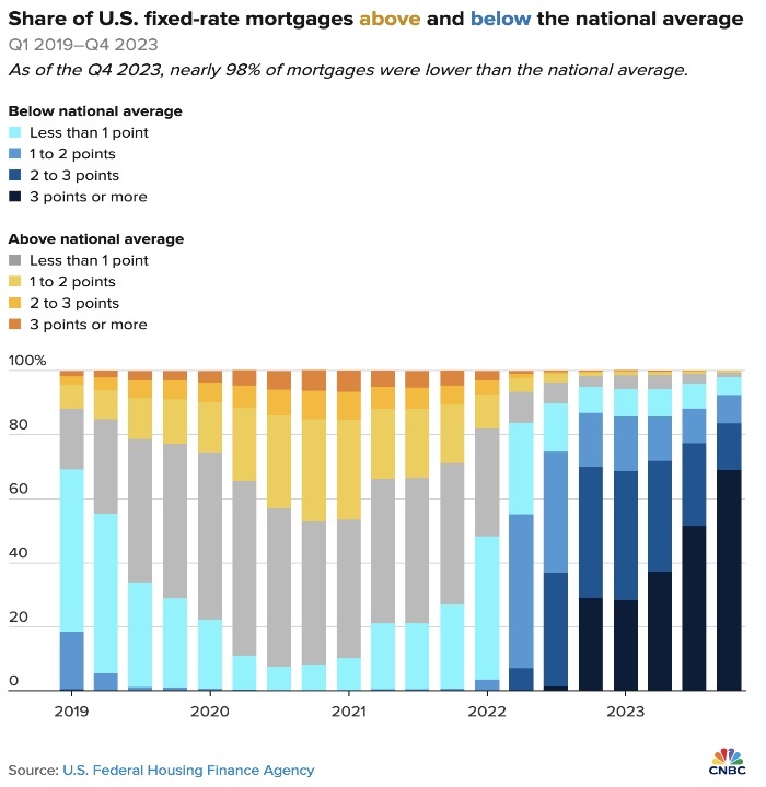
Journalists Gabriel Cortés and Alex Harring shared five other charts. The one I liked best, in terms of visual excitement, was this one:

Basically, this chart is showing us that almost everyone who had a mortgage in 2021 had an interest rate higher than what the Fed was now charging…
…but if you had the same mortgage in 2024, you and almost everyone else with a mortgage were now paying less than what the Fed was now charging. Your mortgage didn’t change, but the color of your mortgage changed from yellowish to bluish.
This means, my landlord is now paying less interest than what she would pay on a brand new mortgage. A lot less.
But because of inflation, I am now paying $200 more in rent.
My landlord bought the house in 1998 for $110,000, and I think she’s almost paid off the mortgage. It’s now valued at $660,000.
So how do we explain skyrocketing housing prices?
Greed. Pure and simple.
No need for colorful charts. Or journalists.
I watched an entertaining 13-minute video yesterday — a debate between left-wing commentator Jon Stewart, host of The Daily Show, and his guest, right-wing commentator Bill O’Reilly. Although these two opinionated guys represent opposite sides of the political spectrum, they were in agreement, amazingly enough, that the inflammatory rhetoric in America needs to get toned down, before someone gets killed.
They didn’t entirely agree about the causes of inflation in America, however.
Here’s a short, 2-minute excerpt from that debate:
We note that Mr. O’Reilly came to the debate partially prepared. He’d brought along reference notes about the rather dramatic inflation that has taken place while Joe Biden has been President. But he didn’t bring along any evidence that Biden’s administration had actually done anything to cause the inflation.
I’m sort of in the same boat as Joe Biden. I didn’t do anything to cause my rent to increase by $200. But maybe the Republicans want to blame me for it?
Now that you mention it, I think my landlord is a Republican…
Like I said. Greed. Pure and simple.
Underrated writer Louis Cannon grew up in the vast American West, although his ex-wife, given the slightest opportunity, will deny that he ever grew up at all. You can read more stories on his Substack account.

