
This past couple of weeks, many of us have been wondering — seriously — about the trends in real estate values, as they have played out in our valuations as published by the Archuleta County Assessors’ team of appraisers.
Tomorrow, Thursday, June 8, is the last day to file a protest with the Assessor, if you believe your assessed valuation is inaccurate. If the Assessor doesn’t agree with your protest, you have until July 15 to file an appeal with the County Board of Equalization.
If you don’t file a protest within the protest period, and eventually succeed in getting the valuation corrected, your property tax next year will be based on your new valuation.
You cannot protest your property tax. You can protest only your valuation.
A couple of days ago, I sent my friend John Bozek a questions about ‘trend lines’, because the Assessor has made “time adjustments” to the price of homes sold during the appraisal period (July 1, 2020 through June 30, 2022) and had hiked the assumed value of homes sold early in the period, because in — in her professional opinion — home prices had shown a general increase over the two years of allowable sales.
Mr. Bozek is a retired nuclear physicist and has some experience with predicting future outcomes based on previous data. Those predictions have occasionally relied upon ‘trend lines’.
Here’s a recent story about a different set of trend lines.
At the May 11 meeting of the Pagosa Area Water and Sanitation (PAWSD) Board of Directors, a group of Pagosa Springs High School students, from JD Kurz’ Global Science class, presented some research they’d done on PAWSD water demand and delivery. The students had used data from 2010 through 2021, and had explored issues such as current demand, factors influencing demand, impacts of drought conditions, and water loss (leakage) trends.
Some Daily Post readers may be aware that PAWSD has been challenged by a leaking system of water pipes for many years, and has been struggling to address the problem of lost treated water.
Disclosure: I current serve as a volunteer on the PAWSD Board of Directors, but this editorial reflects only my own personal opinions, and not necessarily the opinions of the PAWSD Board or staff.
Here’s one of the graphs that the students shared with the Board on May 11.
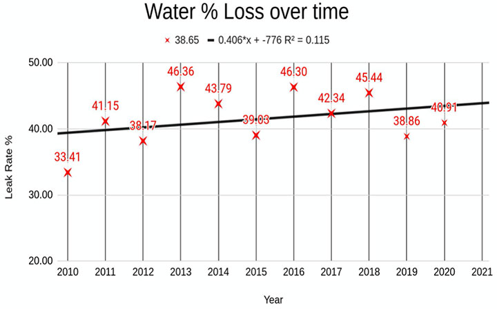
The students plotted the approximate PAWSD ‘water loss’ percentage for each year (2010-2021), and then inserted a ‘trend line’ that suggests a problem getting worse over time. As we see, the percentage of water loss varies widely, from about 33% in 2010 to a high of more than 46% in 2013. The trend line does not exhibit a high ‘confidence’ level, however (as shown by the R2 value of 0.115). But it does suggest a problem that could be looked at more closely.
The students apparently did not know that some of the “treated but eventually unsold water” is actually water used purposely by PAWSD for various production processes. So these numbers, although interesting, are not entirely accurate, if we are considering actual “leakage”.
The trend line, however, still suggests a problem. Many municipal water companies and districts have a leak rate under 10%.
When I asked the students how they calculated the trend line, they responded: “We clicked the button”.
Computer intelligence has developed to a point where we no longer think to question it.
But we might want to question what the trend line means. For example, in the graph shown above, the students included the disclaimer. “R2 = 0.115″
This number indicates how much confidence a statistician or scientist (or county assessor?) should place in the trend line.
The closer “R2” gets to “0.999” the more trustworthy the trend line.
“R2 = 0.115″ means that the PAWSD trend line is, for all intents and purposes, meaningless for making predictions. It’s still interesting for showing a general trend, but you would never use it to predict values. (Like, for example, property values?)
In his work as a nuclear physicist, Mr. Bozek liked to see trend lines with R2 = 0.95 or better. And we should all be thankful that nuclear physicists are properly careful.
I sent Mr. Bozek an Excel spreadheet that I had compiled, listing 19 properties that I felt were “comps” (comparable sales) for my own house in downtown Pagosa, and he generated the following graph and trend lines for those properties, using the “price per square foot” for Prices (the sale price during the appraisal period) and Values (the valuation assigned by the Assessor in May.)
From what I can tell from reviewing Assessor data, the Value of a home is never the same as its Price, even for a home that actually sold during the appraisal period, because the Value (pink dots) is calculated using community-wide averages, rather than the actual individual sale Price (blue dots).
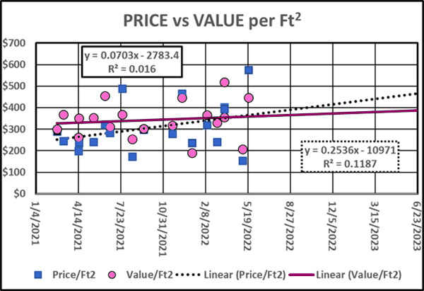
As we see, the Prices per square foot, and the Values per square foot, are all over the place, especially towards the end of the appraisal period (June 30,2022)
Two things I find interesting.
The upward trend line generated by the Actual Prices (the dotted line) projects a greater increase than the trend line for the Assessor-calculated Values (purple line). This suggests to me that the Values (which you can protest if you file by tomorrow) were not excessive, at least in my particular neighborhood.
The other interesting thing is the R2 numbers. You would not put any confidence in these trend line, if you were a nuclear physicist.