
The NPR program ‘Reveal’ plays every Sunday on KSUT, and this past Sunday, the program — “The COVID Tracking Project” — dealt with the quest to track the progress of the COVID virus in the United States. The reporters on the Reveal program reminded us that tracking COVID properly would require a massive data collection effort.
But it almost didn’t happen. In March 2020, White House Coronavirus Task Force coordinator Dr. Deborah Birx assigned a new task to a member of her data team, technologist Amy Gleason: figure out where people were testing positive for COVID-19 in every U.S. county, how many were in hospitals, and how many had died from the disease.
Gleason was shocked to find that disease data from the Centers for Disease Control and Prevention (CDC) was typically weeks, or in some cases, months, behind the spread of a contagious illness.
Realizing that the federal government was failing to collect the necessary data in a timely fashion, reporters at The Atlantic formed The COVID Tracking Project. Across all 50 states, hundreds of volunteers began gathering information on the number of cases, deaths, and hospitalizations; compiling daily data in a massive spreadsheet; and creating the nation’s most reliable picture of the spread of COVID.
How reliable was it?
Compared to the outdated data coming from the CDC, it seemed pretty darned reliable.
But what do we know now, three years later, about how COVID was spread? And why did it spread so differently in various areas of the country? I’m not sure we understand the disease very well, even today, in spite of the COVID Tracking Project and many other intensive data efforts.
Here’s a map of the United States, dated April 2023, showing the number of cases by county. (You can click the map below for a larger, interactive map hosted by The New York Times.)

Why did San Juan County, NM, report 44,000 cases per 100,000 population, when neighboring La Plata County, CO, reported 29,000 (per 100,000), and nearby Catrone County, NM, reported only 15,000 (per 100,000)?
How did the community of Nome, Alaska, track 75,000 cases per 100,000 population — almost one case per person — when the island of Hawaii tracked only 21,000?
How in the world did Loving County, TX track 641,000 cases per 100,000 population? That’s more than six cases per person. While nearby Jeff Davis County, TX reported 14,000 cases per?
Three years later — and after spending $11 trillion dollars on the worldwide COVID response — have we begun to understand why the world map of COVID deaths looks the way it does?
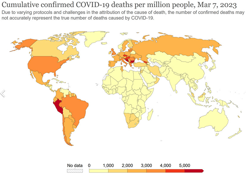
Why did Europe and the Western Hemisphere — the countries that first developed and distributed supposedly effective vaccines — report so many more COVID deaths than Asia?
Where’s the ‘data’ that answers these important questions?
And how much of the $11 trillion was investments in data?
Yesterday, in Part Three, I suggested that some of the data collected by San Juan Basin Public Health in its 2018 Community Health Assessment was relatively meaningless. Meaningless, in the sense that it told SJBPH very little they didn’t already know, and in the sense that the assessment had asked ordinary citizens (like myself, for example) to give our opinions on issues we know very little about.
I also suggested that the Archuleta Board of County Commissioners are in the process of standing up a new Public Health Department, and might be interested in SJBPH’s 2023 Community Health Assessment. Perhaps the 2023 assessment will be more meaningful than the 2018 assessment? Or perhaps not.
We also looked, yesterday at the first slide image included in SJBPH’s April 18 presentation to the Archuleta BOCC, about the 2023 assessment.

This image would seem to support the idea that much of what we call ‘data’ is meaningless, because most of it — 99.5% — will never be properly analyzed and applied to any useful purpose. But because we now have computers on every desktop and housed in every smartphone, and because we’ve created a class of well-paid tech workers whose main job is to create data that will never be properly analyzed and will thus remain meaningless… well, because of that, and other unlovable aspects to our data-driven world, I feel frustrated.
I’m feeling frustrated about ‘data’ at this particular moment, not because of the global COVID response, and not because of the SJBPH assessment process, but because I’m thinking about the ‘SWOT’ (“Strength, Weaknesses, Opportunities, Threats”) discussion held last week at Pagosa Peak Open School, our community’s publicly-funded K-8 charter school.
I currently serve on the PPOS board of directors, and I was part of the ‘Pagosa Charter School Initiative’ group that wrote the school’s charter back in 2016.
Disclosure: Although I serve on the PPOS board of directors, this editorial reflects only my own personal opinions, and not necessarily the opinions of other PPOS board members, nor of the PPOS staff and community.
The April 19 ‘SWOT’ discussion itself was not at all frustrating, and the consultants leading the process — Ashley Wilson and Natasha Bruss — did a fine job of keeping things moving in a positive direction.
The frustration came after the work session was over, and I was back home, thinking about how ‘data collection’ has taken over our education system.
On April 19, as the board conducted this work session, PPOS students and staff were halfway through three weeks of standardized CMAS testing (“Colorado Measures of Academic Success”). This is only one of three or four standardized ‘testing’ protocols to which a typical Colorado school now subjects its students and teachers every year.
Not that the American education system was ever perfect. I came through the system in the 1950s and 1960s — when computerized data collection had barely started — and, looking back, I would estimate that 80% of the time spent in the classroom was wasted, on me and my fellow students. But at least we didn’t spend weeks feeding student data into computers.
Which is another way of saying, “feeding our children into computers”…
Which is another way of saying, “feeding our future into computers”…