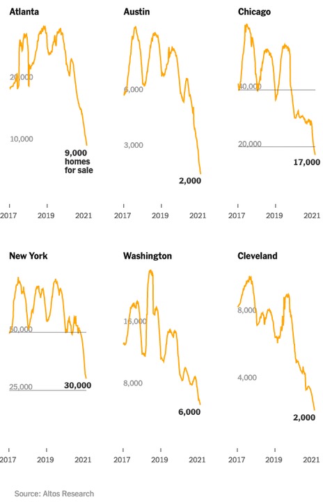
Yesterday, we looked at six graphs from The New York Times, showing the rather dramatic drop in homes for sale in some larger cities. We don’t know why the article’s two authors picked those particular cities, but the graphs were definitely striking.
Summertime has traditionally been the season when most home sales take place in the US, and the volatility shown in the charts above illustrate that pattern of stronger summertime sales. But that pattern seems to have partially disintegrated during the summer of 2020.
From the NYT article:
“The supply side is really tricky,” said Benjamin Keys, an economist at the Wharton Business School at the University of Pennsylvania. “Who wants to sell a house in the middle of a pandemic? That’s what I keep coming back to. Is this a time you want to open your house up to people walking through it? No, of course not.”
A majority of homeowners in America are baby boomers or older — a group at heightened risk from the coronavirus. If many of them have been reluctant to move out and downsize over the past year, that makes it hard for other families behind them to move in and upgrade.
Pagosa Realtor Lee Riley contributes regularly to the Daily Post, and he has noted some rather dramatic changes in our local real estate market over the past year. In particular, he’s written about higher home prices and a lack of inventory.
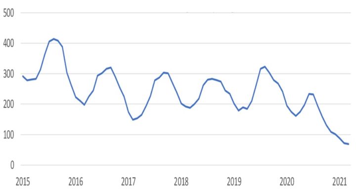
I wrote to Mr. Riley this week, wondering if someone could generate a graph similar to the ones we saw in the NYT article, and Lee put me in touch with his IT specialist, Jarrett Chaney. Yesterday, Jarrett sent me the following graph covering the years 2015-2021:
As we see, the peak in single-family home listings, in this graph, came in the summer of 2015, when more than 400 homes were on the market. (NOTE: this graph does not include for-sale condos or townhomes, or multi-family apartments.) Prior to last year, the low point came in the winter of 2017, when only about 140 homes were listed in Pagosa’s Multiple-Listing Service.
At the moment, in March 2021, the inventory is half what it was in the winter of 2017 — 69 single family homes on the market. A local investor assured me, last week, that the homes still on the market tend to be overpriced… and perhaps also in poor condition.
I mentioned back in Part One that all maps — physical maps, and conceptual maps — are time sensitive. How the world looked in 2015, physically, and in terms of social relationships, is not necessarily how it looks in 2021.
The Pagosa Springs SUN published a story last week, summarizing a Pagosa Springs Chamber of Commerce presentation by Laura Lewis Marchino, the executive director of Region 9 Economic Development District.
The median home price in Archuleta County for 2020 was $410,000, according to Marchino’s presentation. With a 30-year fixed mortgage loan that has a 3 percent interest rate with a 10 percent down payment on the house, buyers would need to be making at least $75,994 per year to qualify for a mortgage loan, as Marchino explained.
“We have almost 70 percent of families who can not afford to even buy a home in Archuleta County,” Marchino added…
Marchino added that, “None of our average teacher salaries is enough for them to purchase a home” across the entire Region 9 district.
“We are not affordable for some of the quality-of-life job sectors: law enforcement, teachers, etc.,” Marchino said…
I couldn’t tell, from the SUN article, whether Ms. Lewis Marchino had referenced the dire lack of housing inventory as an additional challenge to working families and individuals, as we begin the year 2021. She did, however, mention the idea of a “livable wage” — the wage that allows a worker to make their house payment, put food on the table, buy shoes from their children, pay for medical checkups, cover their utility bills, and make their car payment, without going even deeper in debt on credit cards, and taking out loans.
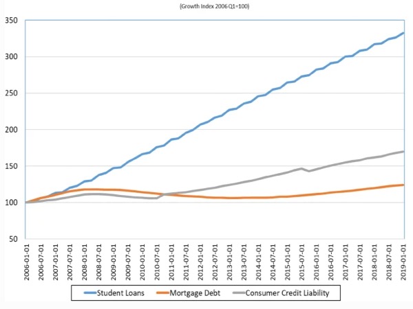
Should we have “debt” included in our conceptual map? Easier said than done. We can’t easily create a map of consumer debt, or even business debt, in Archuleta County in 2021. Some information sources are tracking debt nationally, and note that consumer debt has increased by about 70% since 2006 — that is, since the beginnings of the Great Recession. During that same time period, student debt in the US, measured in inflation-adjusted dollars, has more than doubled .
But between 2006 and 2019, the wages that a college graduate will earn — the wages they will be applying to their average $30,000 in student debt — have remained static in the US. While the average cost of a four-year degree doubled to $104,000 (inflation adjusted) between 1990 and 2016, real median wages barely increased… going from $54,000 to $59,000. Meanwhile, many jobs that didn’t require a college degree in 1990 now demand one.
At the rate we are going, many holders of student debt will reach Social Security age still owing… in some cases with their principal untouched… and many will learn to see themselves as victims in an elaborate con, in which the Department of Education financed an escalating subsidy, first for private banks and loan services, but more particularly for colleges and universities… on the shoulders of our nation’s less-than-financially-savvy young people.
From an article by Steven Deller and Jackson Parr, published in the International Journal of Community Well-Being in January 2021:
Using tax return data from the Internal Revenue Service (IRS) we find that higher levels of student debt tends to be associated with lower levels of community well-being. Specifically, lower rates of home ownership, higher rental market stress, lower rates of entrepreneurship and poor health behaviors…
Although we might accept the authors’ findings, that higher levels of student debt are associated with lower levels of community well-being, we aren’t able to ‘map’ this information, here in Archuleta County. That type of data appears to be available through an IRS search, but no one (that I can find) is tracking it locally.
We can easily understand why student debt is preventing young people from qualifying for home mortgages. It’s possible that young people with college educations are especially unlikely to locate in a community like Pagosa Springs.
We understand that rising consumer debt will make it increasingly difficult for working families to live in Pagosa — the land of the $400,000 home. But debt — overall community debt — remains a blank space in our conceptual map, despite how important as such a detail must surely be to our overall picture of our community. We don’t really know how to draw that part of the map…


