
The Denver Post ran a story yesterday noting an increase in COVID cases in Colorado.
Colorado recorded 2,743 new cases of the coronavirus in the second week of July, reaching a level not seen since early May.
Sunday capped the fourth week of rising infection numbers in the state following a decline since April, reaching a level of new COVID-19 cases not seen since the week ending May 10. While Colorado is still below the late-April peak of 3,761 new infections in one week, it’s much closer than it was in early June, when the state recorded 1,135 new cases.
A total of 37,242 people have tested positive since March, and 5,941 had to be hospitalized. So far, 1,589 people in Colorado have died directly from the virus, and 138 others had it when they died, but it wasn’t confirmed as the cause.
Our eyes begin to blur at the endless stream of numbers. What exactly does a number like “37,242” mean in a state with a population of 5.8 million? Does it mean that hospitals in some communities are being overloaded?
It sometimes feels comforting to simply look at a map, and put all the numbers aside.
From The New York Times, July 14, 2020:
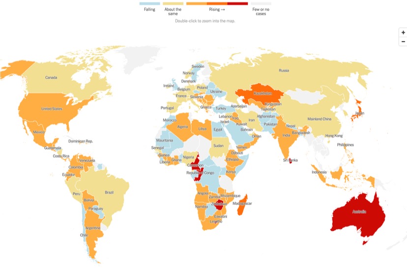
This map purports to show us where the infection rate per day is getting worse (dark red) or slightly worse (orange) or staying the same (yellow) or declining (light blue). The gray areas. such as most of Southeast Asia, show “Few or no cases”. Which could mean, “little testing of the population”… but that’s not entirely clear from the map.
Australia appears dark red this week. The daily infection rate was about 49 new cases per day two weeks ago, but over the past week has been averaging 238 per day — more than a 400 percent increase.
The infection rate in the US, meanwhile, was also climbing, but not nearly so fast. It increased by only about 50 percent this past week, compared to 14 days ago.
But we should be careful about the phrase “only about 50 percent”… because while the infection rate, per day, may have hit 238 in Australia, the average rate of new infections in the US last week exceeded 60,000 per day. Two weeks earlier, the US rate was around 40,000 per day.
Of course, the population of the US (329 million) is much higher than the population of Australia (25 million). To make a perhaps more useful comparison, we would want to look at the number of infections per capita.
Australia: One infection for every 2,400 persons.
US: One infection for every 97 persons.
The New York Times is also updating their US map on a daily basis, and as with the world map, there are areas shown in gray. “Few or no cases.” Most of the western US qualifies as “few or no cases”. Infection numbers appears to be stabilizing somewhat in the larger metropolitan areas of the East Coast, Midwest and South, and increasing in the surrounding, more suburban and rural areas. But that’s just a guess on my part.
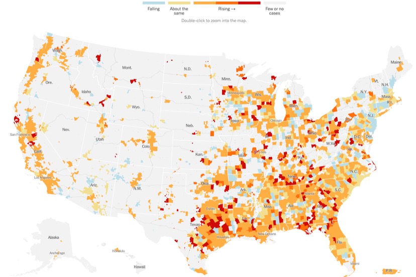
La Plata County (and Durango) had been showing up as orange in recent weeks — “Rising” — but this week are displayed in light blue, the new infection rate having fallen from around 3 cases per day two weeks ago, to about 2 cases per day this past week.
Archuleta County remains gray, (in more than one sense of the word, perhaps).