
High levels of social distancing, sustained throughout April, can not only flatten the curve but bend the curve such that we will see a decline in cases and hospitalizations such that hospital capacity is not exceeded…
— from a highly technical Monday, April 6, analysis by researchers at the University of Colorado Anschutz Medical Campus.
On Wednesday, a friend emailed me a copy of a letter signed by 24 Republican members of the Colorado General Assembly, criticizing Democratic Governor Jared Polis for allegedly keeping coronavirus infection data hidden from Coloradans.
From that letter:
Along with the people of Colorado we are watching the data on COVID-19 cases closely. That data is difficult to interpret at best and incomplete or misleading at worst. We think we need to do better to inform Coloradans of the nature of this crisis. We also note that your office has been unwilling to share the future projections on the spread of the virus you received from CDPHE. This is of great concern. The people of Colorado deserve better.
We understand the severity of this virus. The confidence our citizens depend on to trust their governments actions and the long-term health of our economy must be addressed. As of yet, we have no indication from you about specific guidelines, which will determine when we have made enough progress to put desperate Colorado workers back on the job and allow our businesses to reopen. The public has no way to understand how this virus is progressing since you have refused to release projections to which you have access.
We understand there’s a political battle raging around the current public health crisis, which is also an economic crisis — both unlike any we’ve experienced in our lifetimes. We understand that Democrats and progressives, nationally, are blaming the Trump administration for a failure to address the public health crisis in a timely, even-handed fashion. We understand that, here in Colorado, Republicans and conservatives are blaming Governor Polis (and his fellow Democrats) for implementing public health orders that have forced the Colorado economy into a dangerous holding pattern.
Hard to believe that a virus measuring 120 nanometers in diameter could be turned into a political football.
But maybe it’s really all about listening to what the opposite camp is trying to say? And maybe if the 24 Republican members of the General Assembly were regular reader of the Daily Post, they could have downloaded the Colorado School of Public Health projections we offered our readers on Wednesday — the projections on which Governor Polis’ team appears to be basing its public health decisions?
Here are those projections, again, if you want to download them.
I’m not exactly clear how the Daily Post ended up with documents to which the General Assembly’s Republicans have been denied access. Often, we don’t want to listen, or learn; we just want to complain. (I know the feeling very well.)
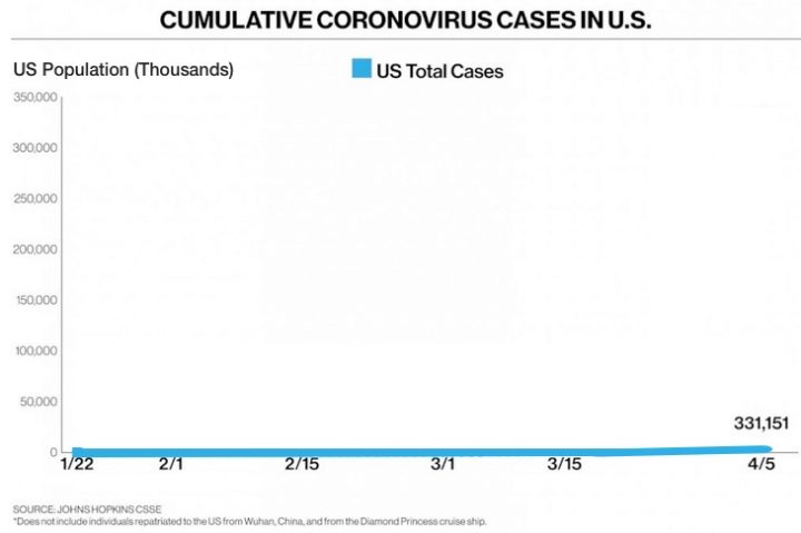
A few days ago, ABC News posted a graph that showed the approximate growth pattern of COVID-19 cases in the US. (These are the confirmed infections, not confirmed deaths.) The graph shows a low level of infections that suddenly grew much larger towards the end of March and the beginning of April.

I would imagine some people, seeing this graph, could feel a sense of impending doom.
This type of graphic display is sometimes referred to as a ‘hockey stick’ because the shape of the curve can bring to mind that particular piece of sports equipment. ABC News ran the dates from January 22 through April 5 along the bottom — the ‘x-axis’.
Running up the left side — the ‘y-axis’ — we see the numbers from 0 to 350,000. This range makes sense because the total cases on April 5 were just shy of 350,000.
But the range on the ‘y-axis’ was, nevertheless, a choice made by ABC News. ABC could have chosen a different range for the ‘y-axis’. They could have chosen, for example, the number of confirmed cases globally. That number, on April 5, was 1.2 million. Had ABC placed that number at the top of the ‘y-axis’, the graph might have looked something like this:

Now we no longer have a hockey stick. More like an airplane taking off, perhaps?
The same data. The same number of cumulative US cases. But a different scale along the left axis.
Okay, since we’re thinking outside the box… What if ABC had chosen to use — instead of 350,000 — the population of the United States of America as the limit for their ‘y-axis’? We would then comparing the number of confirmed cases against the number of potential cases.
Same data. Different ‘y-axis’.
The graph might look more like this:
If we want to be honest about it, this graph is just as ‘truthful’ as the ‘hockey stick’ graph that ABC News shared with the world. It’s just not nearly as frightening, perhaps.
But I can certainly understand why a reputable news source would refrain from sharing a graph like this one, because it would give the impression that nothing much at all was happening — and people might be encouraged to cease practicing ‘social distancing’ and start doing the things they were doing in February. Going to church. Meeting friends at the local brew pub. Taking your girlfriend out to dinner. Working at a paying job.
We’re in a tough place, all of us. The conservatives, the progressives, the folks in the middle. Something is really going on; people are really dying; the economy is really struggling; the federal government can’t print money fast enough to keep up; health care workers is setting up hospital beds in gymnasiums and convention centers; tents have been erected in New York’s Central Park to handle the emergency.

As they refine their computer model, the researchers at teh University of Colorado are still trying to determine how infectious the coronavirus is, the differences in how it spreads in rural areas versus urban settings… and what the future might look like when the state begins to lift social distancing orders.
The ‘Stay At Home’ orders currently extend through April 26. And then?
From a paper by researchers at Imperial College in London:
Two fundamental strategies are possible: (a) mitigation, which focuses on slowing but not necessarily stopping epidemic spread – reducing peak healthcare demand while protecting those most at risk of severe disease from infection, and (b) suppression, which aims to reverse epidemic growth, reducing case numbers to low levels and maintaining that situation indefinitely. Each policy has major challenges…
The London researchers argue that ‘mitigation’ would likely lead to repeated surges in COVID cases, every few months.
However, the resulting mitigated epidemic would still likely result in hundreds of thousands of deaths and health systems (most notably intensive care units) being overwhelmed many times over. For countries able to achieve it, this leaves suppression as the preferred policy option…
Here’s wishing you and yours, a Happy Easter. At home.